Tailwind CSS vs CSS Modules vs Styled Components
Tuesday, Dec 23, 2025
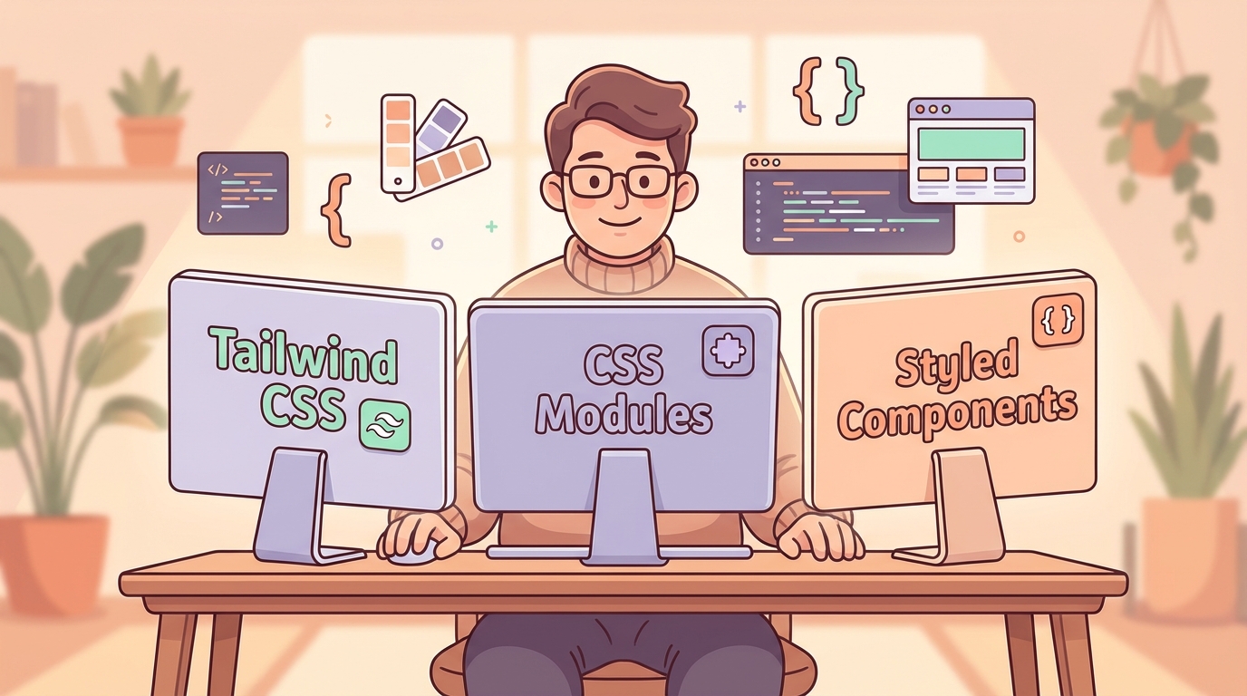
Have you ever been confused about which styling approach to use for a React project? Tailwind CSS is super hyped right now, CSS Modules is proven and stable, and Styled Components has a solid fan base too. Each has its own strengths and weaknesses.
In this article, we’ll thoroughly compare all three approaches. Not just theory, but also real code examples and recommendations on when to use which.
Why Does Choosing a Styling Approach Matter?
The styling approach you choose will affect many things:
- Developer Experience (DX) - How comfortable your team works day-to-day
- Performance - Bundle size and runtime performance of the application
- Maintainability - How easy the code is to maintain long-term
- Scalability - Is this approach suitable for large projects?
Choosing wrong at the beginning can lead to painful refactoring later. So, let’s dive in!
Overview of Each Approach
Tailwind CSS
Tailwind CSS is a utility-first CSS framework. Instead of writing custom CSS, you use utility classes directly in HTML/JSX.
<button className="bg-blue-500 hover:bg-blue-700 text-white font-bold py-2 px-4 rounded">
  Click Me
</button>
Philosophy: “Why write CSS when you can compose utilities?”
CSS Modules
CSS Modules is regular CSS, but with scoped class names. Each class is automatically hashed so there are no naming conflicts.
/* Button.module.css */
.button {
  background-color: #3b82f6;
  color: white;
  padding: 0.5rem 1rem;
  border-radius: 0.25rem;
}
import styles from './Button.module.css';
<button className={styles.button}>Click Me</button>Philosophy: “CSS you know, but safer.”
Styled Components
Styled Components is a CSS-in-JS library that allows you to write CSS directly in JavaScript using tagged template literals.
import styled from 'styled-components';

const Button = styled.button`
  background-color: #3b82f6;
  color: white;
  padding: 0.5rem 1rem;
  border-radius: 0.25rem;

  &:hover {
    background-color: #2563eb;
  }
`;

<Button>Click Me</Button>
Philosophy: “Component-driven styling with the full power of JavaScript.”
Comparison Table
| Aspect | Tailwind CSS | CSS Modules | Styled Components |
|---|---|---|---|
| Bundle Size | Small (with purge) | Small | Larger (~12KB) |
| Runtime Performance | Excellent | Excellent | Slight overhead |
| Learning Curve | Medium | Low | Medium |
| Developer Experience | Great (once familiar) | Good | Great |
| Type Safety | Limited | Limited | Good (with TS) |
| Dynamic Styling | Via class toggling | Via class toggling | Native support |
| Theming | Config-based | Manual | Built-in |
| SSR Support | Native | Native | Needs setup |
| Tooling | VS Code extension, Prettier | Built-in support | VS Code extension |
Code Examples: Button Component
Let’s see how to create the same button component with all three approaches.
Tailwind CSS Button
// Button.jsx
const Button = ({ variant = 'primary', size = 'md', children, ...props }) => {
  const baseStyles = 'font-semibold rounded-lg transition-colors duration-200 focus:outline-none focus:ring-2 focus:ring-offset-2';

  const variants = {
    primary: 'bg-blue-500 hover:bg-blue-600 text-white focus:ring-blue-500',
    secondary: 'bg-gray-200 hover:bg-gray-300 text-gray-800 focus:ring-gray-500',
    danger: 'bg-red-500 hover:bg-red-600 text-white focus:ring-red-500',
  };

  const sizes = {
    sm: 'px-3 py-1.5 text-sm',
    md: 'px-4 py-2 text-base',
    lg: 'px-6 py-3 text-lg',
  };

  return (
    <button
      className={`${baseStyles} ${variants[variant]} ${sizes[size]}`}
      {...props}
    >
      {children}
    </button>
  );
};

// Usage
<Button variant="primary" size="md">Click Me</Button>
<Button variant="danger" size="lg">Delete</Button>
CSS Modules Button
/* Button.module.css */
.button {
  font-weight: 600;
  border-radius: 0.5rem;
  transition: background-color 0.2s;
  border: none;
  cursor: pointer;
}

.button:focus {
  outline: none;
  box-shadow: 0 0 0 2px offset, 0 0 0 4px var(--ring-color);
}

/* Variants */
.primary {
  background-color: #3b82f6;
  color: white;
  --ring-color: #3b82f6;
}

.primary:hover {
  background-color: #2563eb;
}

.secondary {
  background-color: #e5e7eb;
  color: #1f2937;
  --ring-color: #6b7280;
}

.secondary:hover {
  background-color: #d1d5db;
}

.danger {
  background-color: #ef4444;
  color: white;
  --ring-color: #ef4444;
}

.danger:hover {
  background-color: #dc2626;
}

/* Sizes */
.sm {
  padding: 0.375rem 0.75rem;
  font-size: 0.875rem;
}

.md {
  padding: 0.5rem 1rem;
  font-size: 1rem;
}

.lg {
  padding: 0.75rem 1.5rem;
  font-size: 1.125rem;
}
// Button.jsx
import styles from './Button.module.css';
const Button = ({ variant = 'primary', size = 'md', children, ...props }) => {
const classNames = [
styles.button,
styles[variant],
styles[size],
].join(' ');
return (
<button className={classNames} {...props}>
{children}
</button>
);
};
// Usage
<Button variant="primary" size="md">Click Me</Button>
<Button variant="danger" size="lg">Delete</Button>Styled Components Button
// Button.jsx
import styled, { css } from 'styled-components';

const variantStyles = {
  primary: css`
    background-color: #3b82f6;
    color: white;
    --ring-color: #3b82f6;

    &:hover {
      background-color: #2563eb;
    }
  `,
  secondary: css`
    background-color: #e5e7eb;
    color: #1f2937;
    --ring-color: #6b7280;

    &:hover {
      background-color: #d1d5db;
    }
  `,
  danger: css`
    background-color: #ef4444;
    color: white;
    --ring-color: #ef4444;

    &:hover {
      background-color: #dc2626;
    }
  `,
};

const sizeStyles = {
  sm: css`
    padding: 0.375rem 0.75rem;
    font-size: 0.875rem;
  `,
  md: css`
    padding: 0.5rem 1rem;
    font-size: 1rem;
  `,
  lg: css`
    padding: 0.75rem 1.5rem;
    font-size: 1.125rem;
  `,
};

const StyledButton = styled.button`
  font-weight: 600;
  border-radius: 0.5rem;
  transition: background-color 0.2s;
  border: none;
  cursor: pointer;

  &:focus {
    outline: none;
    box-shadow: 0 0 0 2px white, 0 0 0 4px var(--ring-color);
  }

  ${({ variant }) => variantStyles[variant]}
  ${({ size }) => sizeStyles[size]}
`;

const Button = ({ variant = 'primary', size = 'md', children, ...props }) => (
  <StyledButton variant={variant} size={size} {...props}>
    {children}
  </StyledButton>
);

// Usage
<Button variant="primary" size="md">Click Me</Button>
<Button variant="danger" size="lg">Delete</Button>
Pros and Cons
Tailwind CSS
Pros:
- ⚡ Very fast development speed once familiar
- 📦 Small bundle size (unused classes are purged)
- 🎨 Design consistency through config
- 🔧 No context switching between CSS and JSX files
- 📱 Responsive and state variants built-in (
hover:,md:, etc)
Cons:
- 📚 Learning curve to memorize utility classes
- 🤮 “Ugly” HTML with many classes (subjective)
- 🔄 Complex dynamic styles need workarounds
- 📝 Class repetition for the same component
CSS Modules
Pros:
- ✅ Familiar CSS, no need to learn anything new
- 🔒 Scoped styles by default, no naming conflicts
- 📦 Zero runtime overhead
- 🛠️ Great tooling support out of the box
- 🎯 Clear separation of concerns
Cons:
- 📁 Separate file for each component
- 🔄 Dynamic styling is a bit tricky
- 🎨 Theming requires manual setup
- 📝 Naming conventions need team agreement
Styled Components
Pros:
- 🧩 True component-driven styling
- 🔄 Dynamic styling with props is very powerful
- 🎨 Built-in and easy theming
- 📦 Automatic critical CSS extraction
- 🔍 Automatic dead code elimination
Cons:
- 📦 Larger bundle size (~12KB gzipped)
- ⚡ Runtime overhead for style injection
- 🔧 SSR setup can be tricky
- 📚 Need to learn new APIs and patterns
- 🐛 Debugging can be more challenging
When to Use Which?
Choose Tailwind CSS if:
- You want fast development speed
- Your project needs strict design consistency
- Your team is already familiar or willing to invest time to learn
- You’re building landing pages or marketing sites
- You like the utility-first approach
Choose CSS Modules if:
- Your team is already CSS experts and doesn’t want to learn something new
- You need zero runtime overhead
- Legacy project that wants to modernize gradually
- You prefer clear separation of concerns
- SSR performance is a top priority
Choose Styled Components if:
- You’re building a component library or design system
- Dynamic theming is an important requirement
- You like colocating styles with component logic
- Your team is comfortable with the CSS-in-JS paradigm
- You need powerful prop-based styling
Combining Approaches
Plot twist: you don’t have to choose just one!
Many successful teams combine several approaches:
Tailwind + CSS Modules
// Tailwind for utility, CSS Modules for complex styles
import styles from './Card.module.css';

const Card = ({ children }) => (
  <div className={`${styles.card} p-4 rounded-lg shadow-md`}>
    {children}
  </div>
);
Tailwind + Styled Components
import styled from 'styled-components';
import tw from 'twin.macro'; // Library to combine Tailwind with SC

const Button = styled.button`
  ${tw`bg-blue-500 hover:bg-blue-700 text-white font-bold py-2 px-4 rounded`}

  /* Custom styles not in Tailwind */
  animation: pulse 2s infinite;
`;
Combination Tips:
- Tailwind for layout and spacing - Utility classes are perfect for this
- CSS Modules or SC for complex components - Animations, complex states
- Global CSS for typography and resets - Base styles that apply everywhere
Conclusion and Recommendation
After extensively discussing all three, here’s my take:
For new projects in 2024-2025, Tailwind CSS is a solid default choice. Its ecosystem is mature, DX is excellent (once familiar), and performance is top-notch.
But this doesn’t mean the others are bad:
- CSS Modules is still a safe and proven choice, especially if your team is already CSS experts
- Styled Components is still excellent for design systems and apps that need complex dynamic theming
What’s most important is consistency within a project. Choose one main approach and stick with it. Mixing too many approaches can make the codebase messy.
Quick Decision Framework:
Want fast development? → Tailwind CSS
Team are traditional CSS experts? → CSS Modules
Need complex dynamic theming? → Styled Components
Not sure? → Tailwind CSS (safest bet in 2024)
So, do you have an idea of which one to use? Share in the comments your favorite approach and why!
Happy coding! 🚀