
Building a Developer Portfolio with Next.js and Shadcn UI
Monday, Dec 22, 2025
Having a professional portfolio is a must for every developer. In this tutorial, I’ll guide you through creating a modern portfolio using Next.js and Shadcn UI—a component library that’s customizable, accessible, and has no runtime overhead.
Why Shadcn UI?
Shadcn UI is different from other component libraries:
- Customizable - You own the component code, not a dependency
- Accessible - Built on top of Radix UI primitives
- No Runtime - No additional bundle size from the library
- Beautiful by Default - A battle-tested design system
What Will We Build?
A portfolio with features:
- Hero section with animations
- Projects/Portfolio showcase
- About section
- Contact form
- Dark mode toggle
- Responsive design
Prerequisites
- Node.js version 18 or later
- Text editor (VS Code recommended)
- Basic knowledge of React and TypeScript
Step 1: Setup Next.js Project
Open your terminal and run the following command:
npx create-next-app@latest my-portfolio
cd my-portfolio
When prompted, select these options:
- TypeScript: Yes
- ESLint: Yes
- Tailwind CSS: Yes
- src/ directory: Yes
- App Router: Yes
- Import alias: @/*
Step 2: Install and Configure Shadcn UI
Run the command to initialize Shadcn UI:
npx shadcn@latest initChoose the following configuration:
- Style: Default
- Base color: Slate
- CSS variables: Yes
Now install the components we need:
npx shadcn@latest add button card input textarea badge navigation-menuStep 3: Portfolio Folder Structure
Create the following folder structure to organize the project:
src/
├── app/
│   ├── layout.tsx
│   ├── page.tsx
│   └── globals.css
├── components/
│   ├── layout/
│   │   ├── header.tsx
│   │   └── footer.tsx
│   ├── sections/
│   │   ├── hero.tsx
│   │   ├── projects.tsx
│   │   ├── about.tsx
│   │   └── contact.tsx
│   ├── ui/
│   │   └── (shadcn components)
│   └── theme-provider.tsx
├── lib/
│   └── utils.ts
└── data/
    └── projects.ts
Create the required folders:
mkdir -p src/components/layout src/components/sections src/dataStep 4: Setup Theme Provider for Dark Mode
Install next-themes for dark mode:
npm install next-themesCreate file src/components/theme-provider.tsx:
"use client"

import * as React from "react"
import { ThemeProvider as NextThemesProvider } from "next-themes"
import { type ThemeProviderProps } from "next-themes"

export function ThemeProvider({ children, ...props }: ThemeProviderProps) {
  return <NextThemesProvider {...props}>{children}</NextThemesProvider>
}
Update src/app/layout.tsx:
import type { Metadata } from "next"
import { Inter } from "next/font/google"
import "./globals.css"
import { ThemeProvider } from "@/components/theme-provider"
import { Header } from "@/components/layout/header"
import { Footer } from "@/components/layout/footer"

const inter = Inter({ subsets: ["latin"] })

export const metadata: Metadata = {
  title: "John Doe - Full Stack Developer",
  description: "Portfolio of John Doe, a passionate full stack developer",
}

export default function RootLayout({
  children,
}: {
  children: React.ReactNode
}) {
  return (
    <html lang="en" suppressHydrationWarning>
      <body className={inter.className}>
        <ThemeProvider
          attribute="class"
          defaultTheme="system"
          enableSystem
          disableTransitionOnChange
        >
          <Header />
          <main>{children}</main>
          <Footer />
        </ThemeProvider>
      </body>
    </html>
  )
}
Step 5: Creating Header with Theme Toggle
Install dropdown menu component and icons:
npx shadcn@latest add dropdown-menu
npm install lucide-react
Create file src/components/layout/header.tsx:
"use client"
import Link from "next/link"
import { Button } from "@/components/ui/button"
import {
DropdownMenu,
DropdownMenuContent,
DropdownMenuItem,
DropdownMenuTrigger,
} from "@/components/ui/dropdown-menu"
import { Moon, Sun, Menu } from "lucide-react"
import { useTheme } from "next-themes"
export function Header() {
const { setTheme } = useTheme()
return (
<header className="sticky top-0 z-50 w-full border-b bg-background/95 backdrop-blur supports-[backdrop-filter]:bg-background/60">
<div className="container flex h-16 items-center justify-between">
<Link href="/" className="font-bold text-xl">
JohnDoe
</Link>
<nav className="hidden md:flex items-center gap-6">
<Link href="#projects" className="text-sm font-medium hover:text-primary">
Projects
</Link>
<Link href="#about" className="text-sm font-medium hover:text-primary">
About
</Link>
<Link href="#contact" className="text-sm font-medium hover:text-primary">
Contact
</Link>
</nav>
<div className="flex items-center gap-2">
<DropdownMenu>
<DropdownMenuTrigger asChild>
<Button variant="ghost" size="icon">
<Sun className="h-5 w-5 rotate-0 scale-100 transition-all dark:-rotate-90 dark:scale-0" />
<Moon className="absolute h-5 w-5 rotate-90 scale-0 transition-all dark:rotate-0 dark:scale-100" />
<span className="sr-only">Toggle theme</span>
</Button>
</DropdownMenuTrigger>
<DropdownMenuContent align="end">
<DropdownMenuItem onClick={() => setTheme("light")}>
Light
</DropdownMenuItem>
<DropdownMenuItem onClick={() => setTheme("dark")}>
Dark
</DropdownMenuItem>
<DropdownMenuItem onClick={() => setTheme("system")}>
System
</DropdownMenuItem>
</DropdownMenuContent>
</DropdownMenu>
</div>
</div>
</header>
)
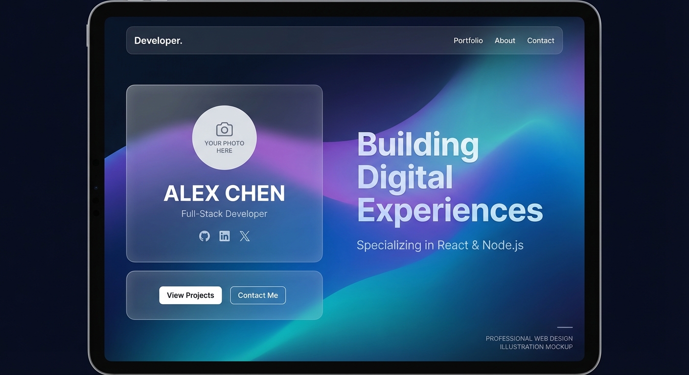
}Step 6: Creating Hero Section
Create file src/components/sections/hero.tsx:
import { Button } from "@/components/ui/button"
import { ArrowRight, Github, Linkedin, Twitter } from "lucide-react"
import Link from "next/link"

export function Hero() {
  return (
    <section className="container py-24 md:py-32">
      <div className="flex flex-col items-center text-center gap-8">
        <div className="space-y-4">
          <h1 className="text-4xl md:text-6xl font-bold tracking-tight">
            Hi, I'm <span className="text-primary">John Doe</span>
          </h1>
          <p className="text-xl md:text-2xl text-muted-foreground max-w-2xl">
            Full Stack Developer passionate about building
            modern and user-friendly web applications.
          </p>
        </div>

        <div className="flex gap-4">
          <Button asChild size="lg">
            <Link href="#projects">
              View Projects <ArrowRight className="ml-2 h-4 w-4" />
            </Link>
          </Button>
          <Button variant="outline" size="lg" asChild>
            <Link href="#contact">Contact Me</Link>
          </Button>
        </div>

        <div className="flex gap-4 mt-4">
          <Button variant="ghost" size="icon" asChild>
            <Link href="https://github.com" target="_blank">
              <Github className="h-5 w-5" />
            </Link>
          </Button>
          <Button variant="ghost" size="icon" asChild>
            <Link href="https://linkedin.com" target="_blank">
              <Linkedin className="h-5 w-5" />
            </Link>
          </Button>
          <Button variant="ghost" size="icon" asChild>
            <Link href="https://twitter.com" target="_blank">
              <Twitter className="h-5 w-5" />
            </Link>
          </Button>
        </div>
      </div>
    </section>
  )
}
Step 7: Creating Projects Section
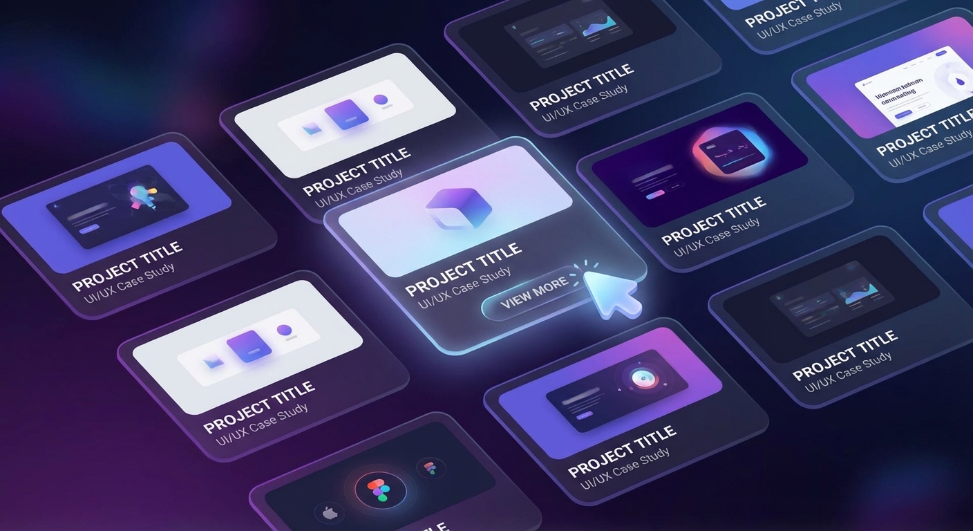
First, create project data in src/data/projects.ts:
export const projects = [
  {
    id: 1,
    title: "E-Commerce Platform",
    description: "Full-stack e-commerce with Next.js, Prisma, and Stripe payment integration.",
    image: "/images/projects/ecommerce.jpg",
    tags: ["Next.js", "Prisma", "Stripe", "PostgreSQL"],
    github: "https://github.com",
    demo: "https://demo.com",
  },
  {
    id: 2,
    title: "Task Management App",
    description: "Real-time task management application with drag and drop functionality.",
    image: "/images/projects/taskapp.jpg",
    tags: ["React", "Node.js", "Socket.io", "MongoDB"],
    github: "https://github.com",
    demo: "https://demo.com",
  },
  {
    id: 3,
    title: "AI Chat Application",
    description: "Chat application with AI assistant using OpenAI API.",
    image: "/images/projects/aichat.jpg",
    tags: ["Next.js", "OpenAI", "Vercel AI SDK", "Tailwind"],
    github: "https://github.com",
    demo: "https://demo.com",
  },
]
Create file src/components/sections/projects.tsx:
import { Card, CardContent, CardDescription, CardFooter, CardHeader, CardTitle } from "@/components/ui/card"
import { Badge } from "@/components/ui/badge"
import { Button } from "@/components/ui/button"
import { Github, ExternalLink } from "lucide-react"
import { projects } from "@/data/projects"
import Image from "next/image"
import Link from "next/link"

export function Projects() {
  return (
    <section id="projects" className="container py-24">
      <div className="space-y-4 text-center mb-12">
        <h2 className="text-3xl md:text-4xl font-bold">Projects</h2>
        <p className="text-muted-foreground max-w-2xl mx-auto">
          Some projects I've worked on
        </p>
      </div>

      <div className="grid md:grid-cols-2 lg:grid-cols-3 gap-6">
        {projects.map((project) => (
          <Card key={project.id} className="overflow-hidden group">
            <div className="relative h-48 overflow-hidden">
              <Image
                src={project.image}
                alt={project.title}
                fill
                className="object-cover transition-transform group-hover:scale-105"
              />
            </div>
            <CardHeader>
              <CardTitle>{project.title}</CardTitle>
              <CardDescription>{project.description}</CardDescription>
            </CardHeader>
            <CardContent>
              <div className="flex flex-wrap gap-2">
                {project.tags.map((tag) => (
                  <Badge key={tag} variant="secondary">
                    {tag}
                  </Badge>
                ))}
              </div>
            </CardContent>
            <CardFooter className="gap-2">
              <Button variant="outline" size="sm" asChild>
                <Link href={project.github} target="_blank">
                  <Github className="h-4 w-4 mr-2" /> Code
                </Link>
              </Button>
              <Button size="sm" asChild>
                <Link href={project.demo} target="_blank">
                  <ExternalLink className="h-4 w-4 mr-2" /> Demo
                </Link>
              </Button>
            </CardFooter>
          </Card>
        ))}
      </div>
    </section>
  )
}
Step 8: Creating About Section
Create file src/components/sections/about.tsx:
import { Badge } from "@/components/ui/badge"
import Image from "next/image"

const skills = [
  "JavaScript", "TypeScript", "React", "Next.js",
  "Node.js", "PostgreSQL", "MongoDB", "Prisma",
  "Tailwind CSS", "Git", "Docker", "AWS"
]

export function About() {
  return (
    <section id="about" className="bg-muted/50 py-24">
      <div className="container">
        <div className="grid md:grid-cols-2 gap-12 items-center">
          <div className="relative aspect-square max-w-md mx-auto">
            <Image
              src="/images/profile.jpg"
              alt="John Doe"
              fill
              className="object-cover rounded-2xl"
            />
          </div>

          <div className="space-y-6">
            <h2 className="text-3xl md:text-4xl font-bold">About Me</h2>
            <div className="space-y-4 text-muted-foreground">
              <p>
                Hello! I'm John, a Full Stack Developer with 5+ years of
                experience building web applications. I'm passionate about
                creating digital solutions that are not only functional
                but also provide an excellent user experience.
              </p>
              <p>
                Currently, I focus on modern technologies like Next.js,
                TypeScript, and cloud services. In my spare time, I enjoy
                contributing to open source and writing technical articles.
              </p>
            </div>

            <div className="space-y-4">
              <h3 className="text-xl font-semibold">Tech Stack</h3>
              <div className="flex flex-wrap gap-2">
                {skills.map((skill) => (
                  <Badge key={skill} variant="outline">
                    {skill}
                  </Badge>
                ))}
              </div>
            </div>
          </div>
        </div>
      </div>
    </section>
  )
}
Step 9: Creating Contact Form
Create file src/components/sections/contact.tsx:
"use client"

import { useState } from "react"
import { Button } from "@/components/ui/button"
import { Input } from "@/components/ui/input"
import { Textarea } from "@/components/ui/textarea"
import { Card, CardContent, CardDescription, CardHeader, CardTitle } from "@/components/ui/card"
import { Mail, Send } from "lucide-react"

export function Contact() {
  const [isLoading, setIsLoading] = useState(false)

  async function handleSubmit(e: React.FormEvent<HTMLFormElement>) {
    e.preventDefault()
    setIsLoading(true)

    // Implement form submission
    // Can use API route or service like Formspree
    await new Promise((resolve) => setTimeout(resolve, 1000))

    setIsLoading(false)
    alert("Message sent! I'll get back to you soon.")
  }

  return (
    <section id="contact" className="container py-24">
      <div className="max-w-xl mx-auto">
        <Card>
          <CardHeader className="text-center">
            <div className="mx-auto w-12 h-12 bg-primary/10 rounded-full flex items-center justify-center mb-4">
              <Mail className="h-6 w-6 text-primary" />
            </div>
            <CardTitle className="text-2xl">Get In Touch</CardTitle>
            <CardDescription>
              Have an interesting project? Let's discuss and work together!
            </CardDescription>
          </CardHeader>
          <CardContent>
            <form onSubmit={handleSubmit} className="space-y-4">
              <div className="grid grid-cols-2 gap-4">
                <div className="space-y-2">
                  <label htmlFor="name" className="text-sm font-medium">
                    Name
                  </label>
                  <Input
                    id="name"
                    placeholder="John Doe"
                    required
                  />
                </div>
                <div className="space-y-2">
                  <label htmlFor="email" className="text-sm font-medium">
                    Email
                  </label>
                  <Input
                    id="email"
                    type="email"
                    placeholder="[email protected]"
                    required
                  />
                </div>
              </div>
              <div className="space-y-2">
                <label htmlFor="subject" className="text-sm font-medium">
                  Subject
                </label>
                <Input
                  id="subject"
                  placeholder="Project Collaboration"
                  required
                />
              </div>
              <div className="space-y-2">
                <label htmlFor="message" className="text-sm font-medium">
                  Message
                </label>
                <Textarea
                  id="message"
                  placeholder="Tell me about your project..."
                  rows={5}
                  required
                />
              </div>
              <Button type="submit" className="w-full" disabled={isLoading}>
                {isLoading ? (
                  "Sending..."
                ) : (
                  <>
                    Send Message <Send className="ml-2 h-4 w-4" />
                  </>
                )}
              </Button>
            </form>
          </CardContent>
        </Card>
      </div>
    </section>
  )
}
Step 10: Creating Footer
Create file src/components/layout/footer.tsx:
import Link from "next/link"
import { Github, Linkedin, Twitter } from "lucide-react"

export function Footer() {
  return (
    <footer className="border-t py-8">
      <div className="container flex flex-col md:flex-row justify-between items-center gap-4">
        <p className="text-sm text-muted-foreground">
          © {new Date().getFullYear()} John Doe. All rights reserved.
        </p>
        <div className="flex gap-4">
          <Link
            href="https://github.com"
            target="_blank"
            className="text-muted-foreground hover:text-foreground"
          >
            <Github className="h-5 w-5" />
          </Link>
          <Link
            href="https://linkedin.com"
            target="_blank"
            className="text-muted-foreground hover:text-foreground"
          >
            <Linkedin className="h-5 w-5" />
          </Link>
          <Link
            href="https://twitter.com"
            target="_blank"
            className="text-muted-foreground hover:text-foreground"
          >
            <Twitter className="h-5 w-5" />
          </Link>
        </div>
      </div>
    </footer>
  )
}
Step 11: Combine Everything in Homepage
Update src/app/page.tsx:
import { Hero } from "@/components/sections/hero"
import { Projects } from "@/components/sections/projects"
import { About } from "@/components/sections/about"
import { Contact } from "@/components/sections/contact"

export default function Home() {
  return (
    <>
      <Hero />
      <Projects />
      <About />
      <Contact />
    </>
  )
}
Step 12: Run the Project
Now run the development server:
npm run devOpen http://localhost:3000 to see your portfolio!
Step 13: Deploy to Vercel
Deploying your portfolio to Vercel is very easy:
npm install -g vercel
vercel
Or just push to GitHub and connect the repository at vercel.com. Vercel will automatically detect Next.js and perform the deployment.
Conclusion
Congratulations! You’ve successfully created a professional developer portfolio with Next.js and Shadcn UI. Some benefits of this stack:
- Next.js 14 - App Router, Server Components, and optimal performance
- Shadcn UI - Accessible and fully customizable components
- TypeScript - Type safety to reduce bugs
- Dark Mode - Modern UX with next-themes
- Vercel - Seamless and free deployment
From here, you can further develop by adding:
- Blog section with MDX
- Animations with Framer Motion
- CMS to manage projects
- Analytics for tracking visitors
Have questions or want to discuss? Reach out to me on Twitter @nayakayp!